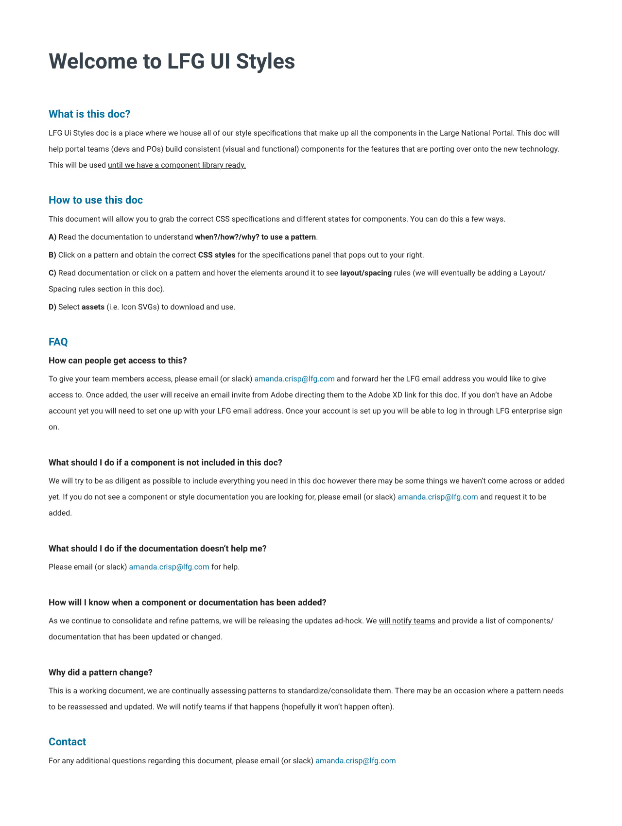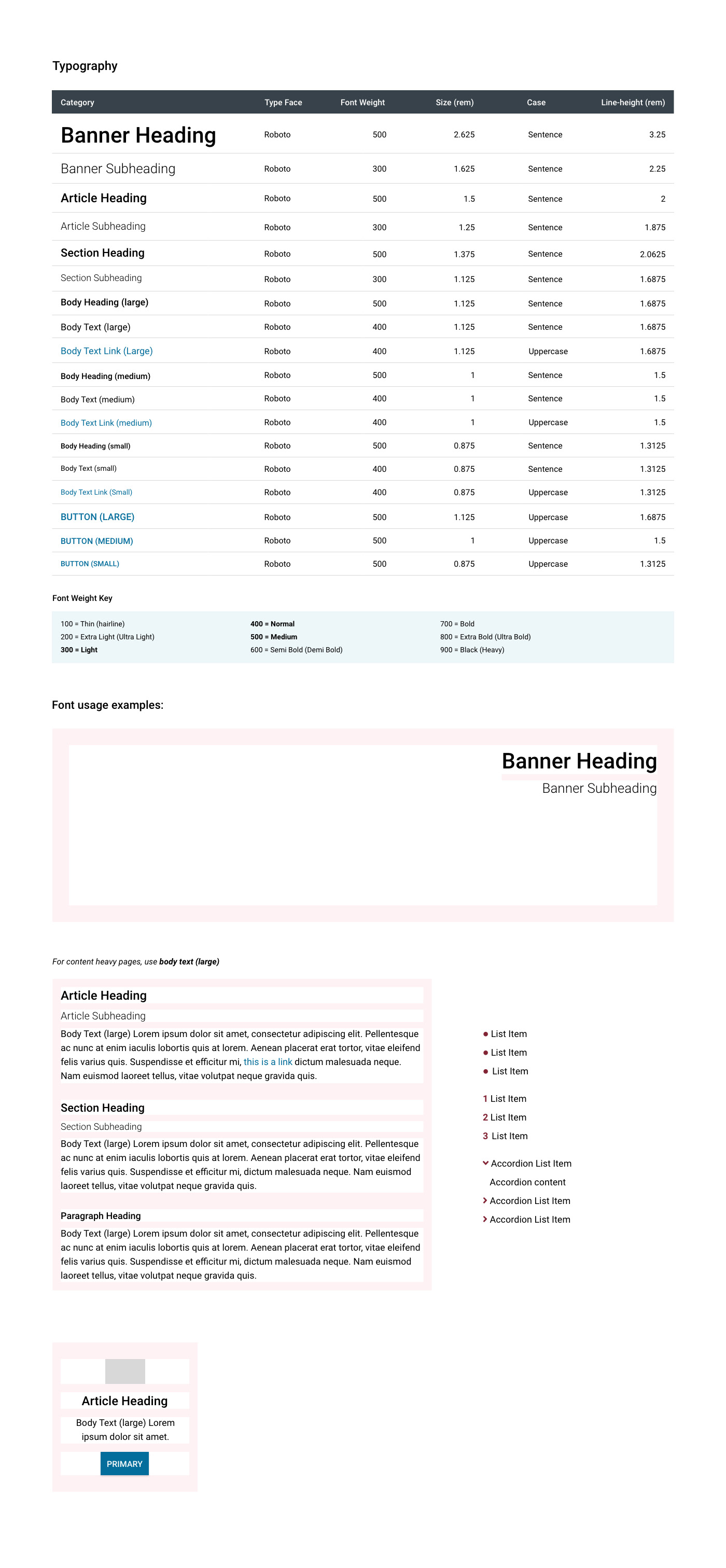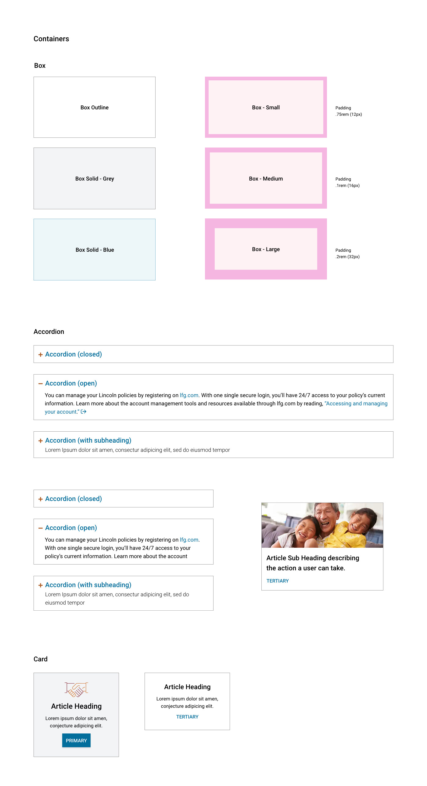
A design system, at its core, is a collection of clearly defined styles and standards (the style guide) that are built into reusable parts (component library) and are used by product teams to design and build applications more efficiently.
MY ROLE FOR THIS PROJECT:
• Style Guide Owner & Contributor
• Consultant to Product Teams
THE PROBLEM:
When I first came on to the team, I had a huge task in front of me. Our current product being constructed had no consistency in how it functioned and appeared. Teams weren't communicating with each other on how a product should be built. Standards desperately need to be put in place.
THE GOAL:
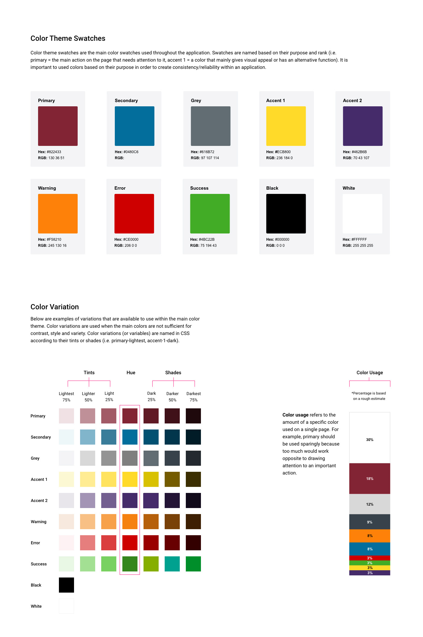
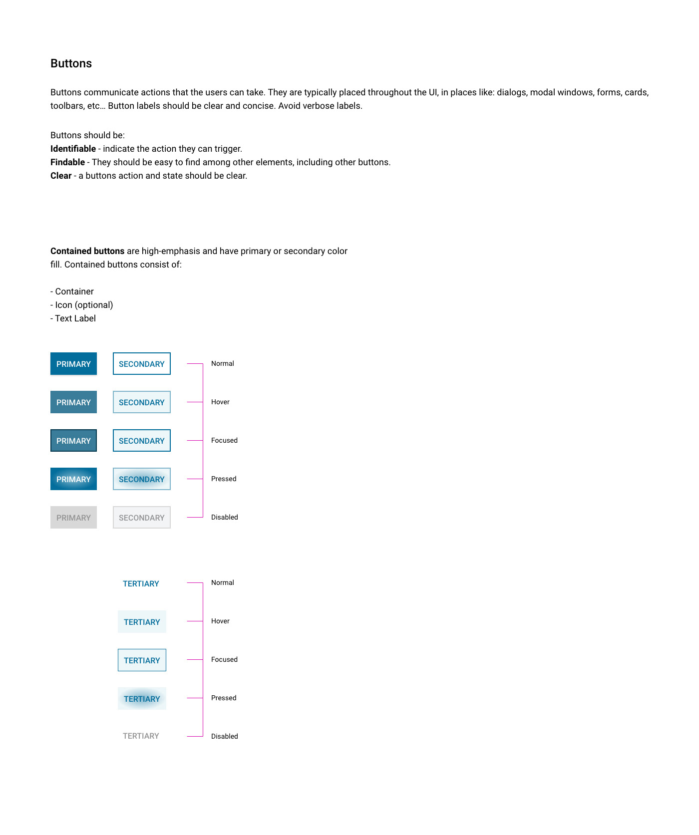
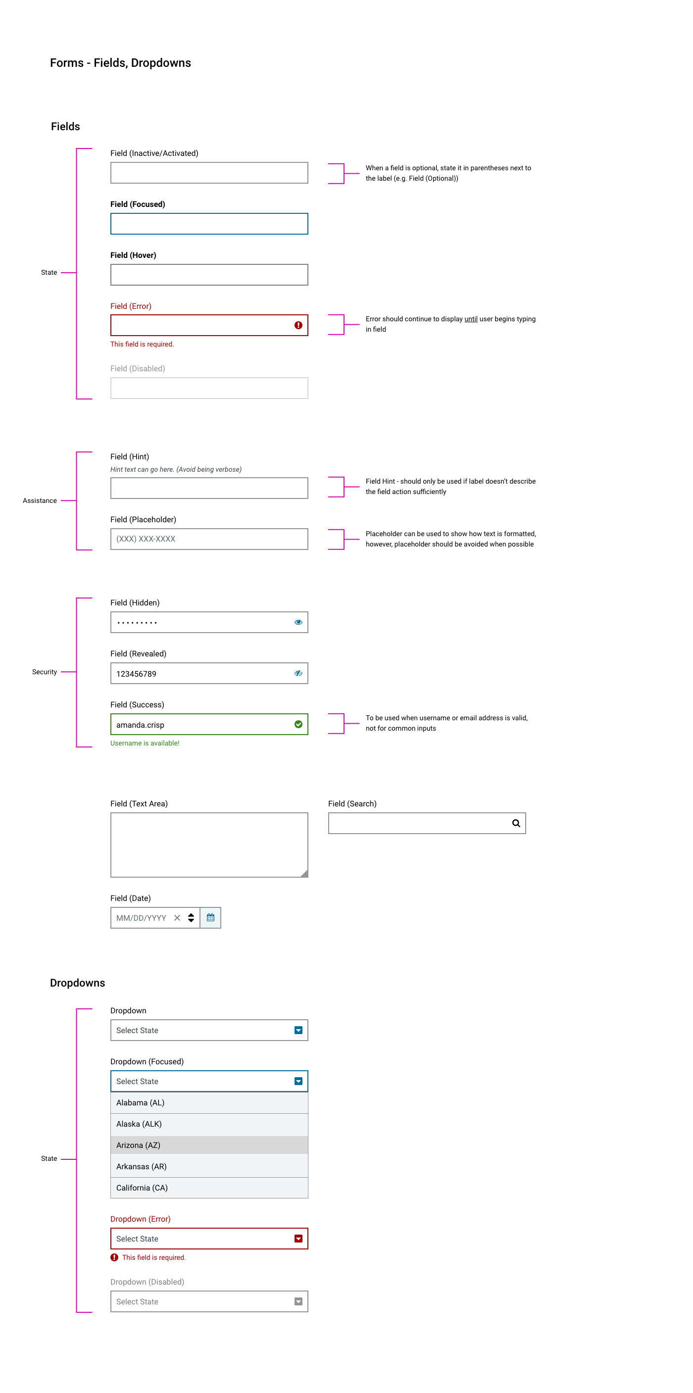
To consolidate, refine and define existing styles across all applications that can be found in one place (the style guide) and build them as working components (component library) to be used by engineers across the entire portal.
THE PROCESS:
• Define and consolidate patterns based on their functionality and purpose.
• Access and refine patterns to meet WCAG standards.
• Partner with front-end developers to build (accessible) patterns into working React.js components that engineer teams can utilize.
THE OUTCOME:
No solution is perfect in the beginning. Time and talent is a limited resource on busy product teams and not all full-stack developers have the same level of front-end skill. However, once they were given a working visual document with specifications (thanks to Adobe XD) and clearly defined functionality, they were slowly but surely able to to form a dedicated team to build out these patterns. For patterns that had yet to be built out, other teams could reference our style guide to adhere to our product standards.
Samples of the Design System, Style Guide
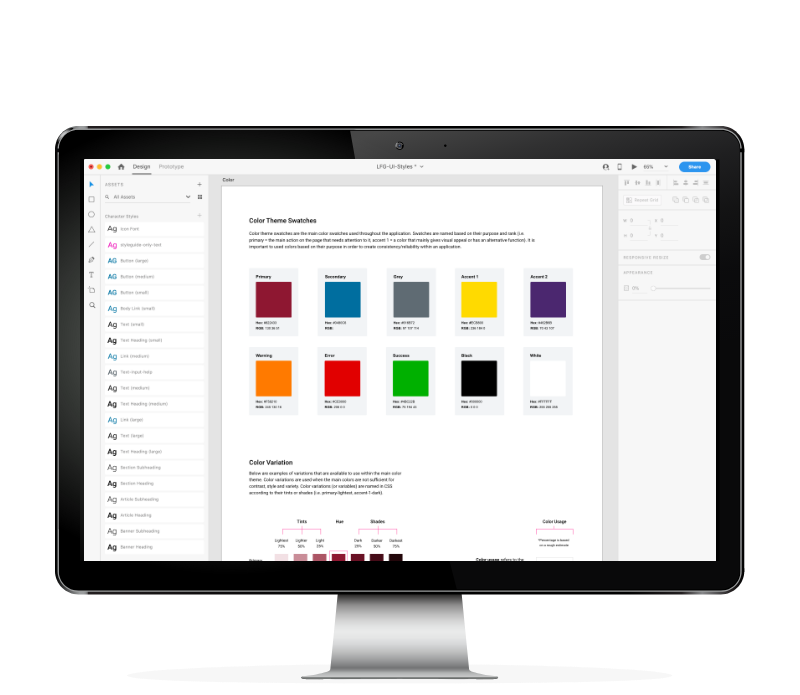
CLICK TO VIEW LARGER